AWSMonitor - explore CloudWatch analytics from Amazon Web Services
Awhile ago I wrote about developing a page to bring in some rudiementary cloud-watch data to measure and compare realtime trafffic of an ELB (Elastic Load Balancer) enabled website and the performance of the providing servers. Part of my role at Condé Nast Digital is to become fixated on be aware of the performance of our public-facing web sites, and be able to pre-empt or respond quickly to any traffic spikes or performance issues. To that end, I spend some time thinking of new ways to visualize and explore this data for both myself and my team. In wishful style, I’ve open-sourced a web app containing these visualizations, in the hope that others contribute in the form of ideas or code, or at least get some use out of it so I can more easily justify the late nights. The AWSMonitor project on CodePlex explains each visualization and offers a roadmap, a forum to discuss new visualizations, and the code to download and run. The app is written in ASP.Net MVC3 and uses Razor views. The views use the javascript Google Visualization API to render graphs and gauges (favouring svg versions). There are two main ways I use the visualizations in this app daily: Infoporn - office displays I love to have screens of realtime data on show so that everyone can easily see what’s going on, both in terms of editorial content, new features, traffic and server performance.
The /elb/random view really shines here as it displays a new site from our list of load-balancers on AWS after each interval.

In this visualization we can see:
- A graph comparing the traffic today (blue), yesterday (red), today -7 days (yellow) and today - 14 days (green)
- A gauge showing the average CPU utilization for each server
- A frame containing the site’s output Problem Investigation AWS ELB manages server health and will take servers out if the health check target responds with an error. When this happens, I like to see exactly what’s happening on each server. The /elb/{load-balancer-name}/preview shows what the site looks like for each server
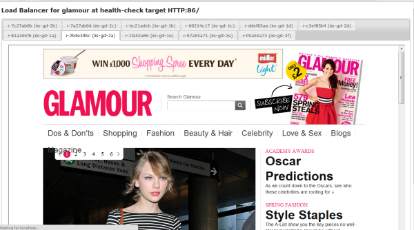
This visualization also accepts a parameter that allows us to see a specific Url for each server.